Collaboration OS · Design System Draft · v0.3
The Action
Verbs made Visual
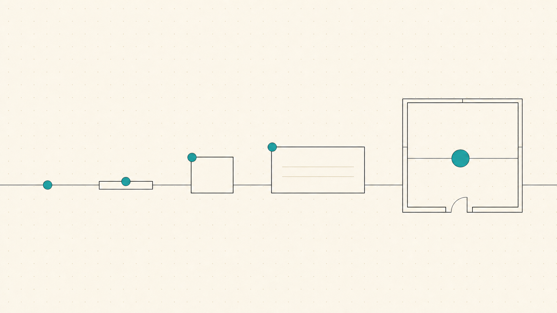
Every piece of work the studio does — a page to write, a call to hold, a bug to fix — is an action. Actions live in one database, synced two-way with ClickUp, but they appear all over the OS: on timelines, in lists, on boards, inside engagement pages, across the spatial field. Rather than one card design squeezed everywhere, an action has five expressions — from a bare dot on a map to a full room you can step inside — and a fixed visual grammar (color for status and time, shape for everything else) that keeps it recognizable at every size. The view decides the size; the action stays itself. This page is a working prototype: click any status dot to advance it, click-and-hold for the full status menu, click a row or card to open the editor, and edit any name or description in place.
The Language
Each fact owns one visual channel. Open circles are intention (idea, planned, scheduled); solid circles are reality (underway, done, integrated, closed). Time pressure is a thin solid halo that fades with distance — full red when overdue, translucent orange this week, translucent yellow next week, bare beyond. Rings are drawn outside the dot, so ringed and bare circles always align perfectly.
| Fact | Channel | Vocabulary — click the dots, hold for the menu |
|---|---|---|
| Status (Action Process) | Fill color + fill state | idea planned scheduled underway done integrated closed |
| Time pressure | Thin ring + date color | overdue this week next week no date — bare |
| Invested time | Lavender — text + edge bar (2px per 5 min) | 2h45m |
| Type | Glyph — shape, never color | design build write meet review bug prompt |
| Ownership | Avatar |

 |
| Domain / parent | Chip + position | Website |
| Priority | Flag — outline raised, filled high | raised high |
Prompt = an action delegated to AI — the sparkle appears only as a type glyph, never as decoration. · Color budget: status, time pressure, invested time. Nothing else.
XS — the point
Status-filled dot, time-pressure ring, priority flag rising from the dot's right edge. No name — hover reveals the card; click the card to open the editor. Rails and wires pass exactly through dot centers: the point is geometry first, symbol second.
On a timeline — position = date
Website · due Jul 8 · overdue
Map interoperability standards
Platform · due Jul 14
Draft data-model principles
high priority · Platform · due Jul 17
Explore festival microsite
idea · unassigned · no date
Brand direction approved
done Jul 2 · Brand
In a node chart — position = relationship
- Geometry rule: the dot's center IS the datapoint — rails and wires address the center, never the bounding box
- Open vs solid reads at a distance: a field of intention vs a field of motion
- Flag on the right: the pole rises from the dot's right edge — never covers the dot
- Click dot: advance · hold: status menu · click hover-card: open editor
S — the line
Type sits outside the item, far left — a quiet margin column, like a proof mark. The status dot straddles the card's left edge. Click the row to open the editor; facts the container states are auto-excluded.
Jul 8
Jul 14
Jul 17
Jul 2- Type in the margin: scanning the left column reads the texture of the work before any names
- Dot on the edge: the action's state lives on its boundary — half in the world, half in the card
- Name editable in place; row opens the editor; dot click advances, hold for menu
- Excludes by context: assignee inside a person's lane; due date on a dated lane
M — the card
Status dot centered on the top-left corner — state greets you before the card does. Type is larger; domain chip holds the top-right. The lavender edge bar grows from the bottom, 2px per 5 minutes tracked. Along the bottom edge, faint notches mark days — one every 13px — and a small red diamond sits on the due day. From M up, every card quietly carries its own horizon.
Refine homepage hero copy
Jul 8
2h45mPartner alignment call — ecosystem round two
Jul 14
0h50mPrompt: generate festival microsite directions
- Corner dot: straddles the card corner like a wax seal — visible even when cards tile
- Time made physical: 2h45m = 66px of lavender rising up the right edge
- Scan order: status (corner) → type → name → people → time
- Click card: editor · click dot: advance · hold dot: menu · name: editable
L — the panel
The action opened: description, provenance, belonging — symbols carry what labels used to say. This same panel is the modal that XS, S, and M open into.
Refine homepage hero copy
due Jul 8 · overdue2h45mCurrent hero reads as generic movement language. Tess wants the "warriors for the planet — not through fighting" turn preserved verbatim from the discovery call, then one sentence on collective coherence. Two variants for Thursday.
- Symbols replace labels: stacked layers = artifact of origin; interlinked circles = engagement. Tooltips carry the words
- Modal duty: clicking an XS hover-card, S row, or M card opens this panel as an overlay
- Everything editable: title and description edit in place here and in the modal
XL — the space
The action becomes a place, with the artifact's own generated banner as its face. The stage is named above a quiet constellation — current stage large and opaque, the rest faded; hover names them, click jumps. Connections curve away outside the walls.
underway
Refine homepage hero copy
James Carter · 2h45m · due Jul 8Current hero reads as generic movement language. Preserve the "warriors for the planet — not through fighting" turn verbatim; add one sentence on collective coherence. Two variants for Thursday.
Subactions
Activity
- Created from Discovery Call artifactJul 3
- Scheduled by JamesJul 4
- Subaction completed — quotesJul 5
- Moved to underwayJul 6
- 2h45m across 3 sessionsJul 6–7
- Stage named, then shown: the label above the constellation says the word; the dots say the trajectory
- Constellation: six small faded dots, current stage large and opaque; hover names, click jumps — the label follows
- Connections curve outside the walls — the action is a room, its relationships are the street
- Subactions are S-rows, unchanged — the system nests by reusing smaller sizes
Renderer contract
Action size:      xs | s | m | l | xl          // set by the view model's density
Context provides: { assignee? domain? date? engagement? }
Rule 1  Never render a fact the container already states.
Rule 2  Status dot + time ring survive at every size. Open = intention,
        solid = reality. Time ring = thin solid halo, fading with distance:
        red overdue, translucent orange this week, translucent yellow next
        week, bare beyond. Rings are box-shadows — never part of layout,
        so all dots share identical geometry. From M up, the bottom edge
        carries day notches (13px = 1 day) with a red diamond on the due day.
Rule 3  Anatomy is fixed per size; size transitions animate the same parts.
        Rails and wires always address the dot's CENTER.
Rule 4  Hover previews the next size up. Click opens L (as modal below XL).
        Dot: click advances the Action Process, hold opens the full menu.
Rule 5  Color budget: status + time pressure + invested time (lavender).
        Type = Phosphor glyph, people = avatar, priority = flag, hierarchy = position.
Rule 6  Edits happen in place at every size; L-modal is the full editor.
Draft v0.3 · tokens from app/globals.css · icons:
Phosphor · avatars & banner from the live Supabase brand bucket ·
companion site at lab.iriscocreative.com/collab-os